THE MAKING OF MY LOGO..
- Isabelle Osorio
- May 31, 2019
- 2 min read
Updated: Jun 1, 2019
Here are the rough sketches of my logo before developing them on (insert) software. This project, I wanted to steer away from stereotypical credits as seen in many of my other projects. I figured I wanted to put an even more personal spin on my FMP and therefore I decided to go with a logo. I wanted my logo to be very personal so people know it is mine, however, I didn't want to make it too obvious. Here are some of my initial sketches of possible ideas...


Here are images of the process between (insert name) and photoshop...


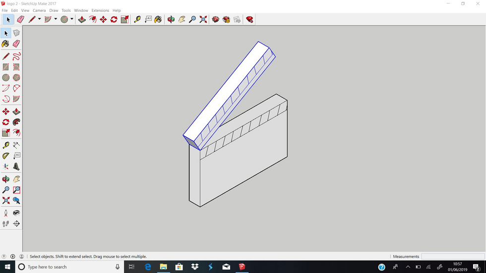


I managed to design a few, bringing them to life in order to have a selection of options to pick from depending on which one I feel will fit best in my final video. Here are images of my favourite designs. Personally I like the idea of a more simplistic design. However, I still wanted to ensure that they were film related and clear to be mine.


I decided to go with the bottom left edit. I felt as though the simplicity fit my vision the best with it clear it being very clear it is my work. The discrete I,O and P for Isabelle Osorio Productions looks unique and allows me to have my own stamp on the regular outline of the camera. These are then colour coded in grey to make it clear that they are symbolising the letters. There is a lot of thought behind this logo however it still looks subtle which I love.
I have decided to put my logo at the end of my piece in the end after lots of thought, considering whether the logo should appear in the start and the end. After trial and error it appears to look much better just at the end. which is where I have now placed it.
I think the logo works better than everyday credits because it puts a more personal stamp on my piece. I love the end result and will be using my logo more in the future as a way to make my mark.


Comments